 WASHINGTON.
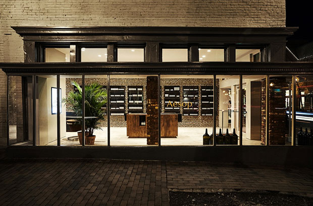
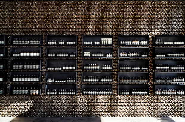
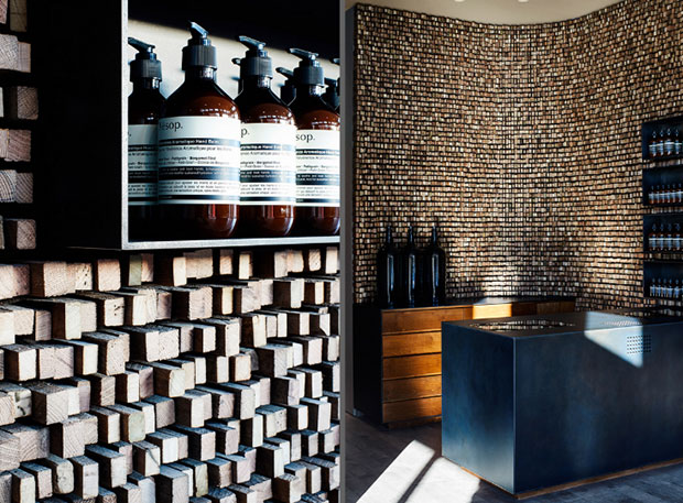
For Aesop’s second Washington, D.C. presence, it is a pleasure to settle in historic Georgetown – a port city that thrived due to the lively commerce and tobacco trade born of its position astride the Potomac River. Created in collaboration with Tacklebox under the leadership of Jeremy Barbour, the design is defined by local heritage, pairing a distinctive visual language with evocative materiality to weave the store into the fabric of the neighborhood. In a nod to the tobacco barns once common to the area, the 900-square foot space is distinguished by its use of 100-year-old Southern Pine sticks – a humble material traditionally used to hang and cure tobacco leaves. Cut and stacked en masse, 30,000 individual sticks serve to clad the eastern side of the corner tenancy, fashioning a dynamic rippled surface.
 This textural gesture is punctuated by a grid of product display cases in powder-coated steel. Working in concert with a sink of reclaimed Southern Pine, these vessels symbolize the site’s unique history with bodies of water, including an adjacent natural spring which influenced the local industry.

Photos: Tacklebox Architecture.


