
LONDON.
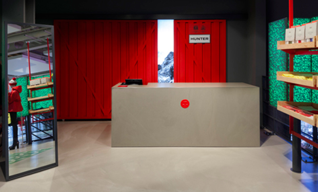
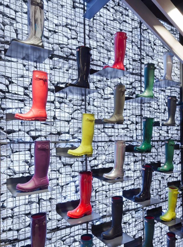
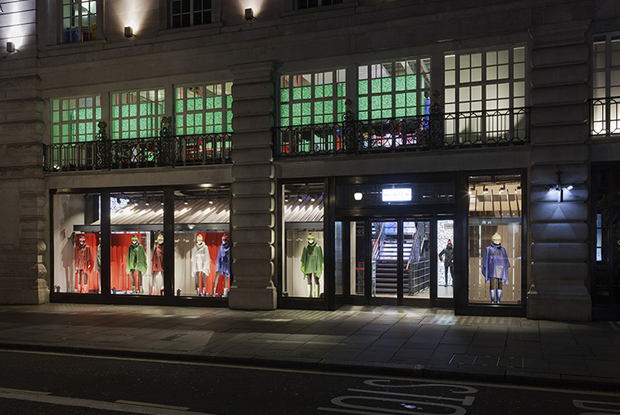
The innovative design of this flagship store takes iconic references from the British countryside and reappropriates them for the urban setting. The store creates a new take on rural architecture and the outdoors, redefined in the spirit of Hunter.
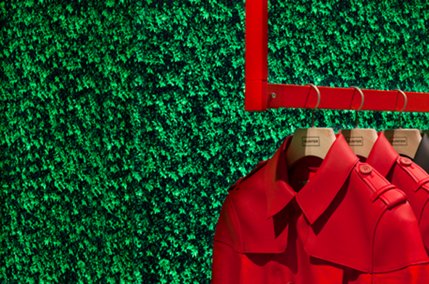
The first floor of this store references the British eccentricity of the brand with a surreal take on an enclosed English garden, where the collection is displayed against a backdrop of topiary hedges, which pop as illuminated pieces of art; whilst the hand-made green ceramic floor tiles hint at an archetypal well-kept lawn.

The kid’s retail space in the basement has a distinctly different feel to the other floors. The playful space is a contrast of Hunter red and white, designed to feel as if the basement has been part dipped in red rubber.
“The store design brings together the pioneering energy, spirit and innovative character of the Hunter brand. It’s a careful and thoughtful blend of nature, materials, the vernacular of agricultural architecture and art.” Jeff Kindleysides.
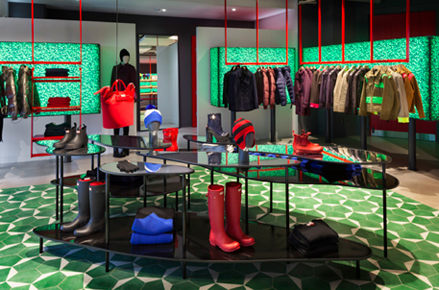
The concept for the 5,300 sq ft store on London’s Regent Street will form the foundation of future retail and shop-in-shop opportunities worldwide.
«The Regent Street flagship is the first opportunity for the Hunter customer to enter the home of this iconic British brand. This ambitious new store concept starts to clearly deliver a retail experience that represents the brand’s exciting new vision and future», says the firm’s creative director.

Hunter‘s first global flagship store is collaboration between the company’s creative director, Alasdhair Willis, and retail designers of Checkland Kindleysides.
Photos: Checkland Kindleysides.


