KOBE.
Otsuka-Gofukuten is a traditional Japanese dress store named Gofuku (another word for Kimono) and their aim is to return the Kimono back into everyday life again. Nowadays people tend to wear Kimonos only on special occasions, but this store challenges this preconception by promoting the wearing of Kimonos as part of a modern daily fashion routine.
Yusuke Seki designed the initial flag-store in Kyoto, as well as this second branch, based within a shopping mall in the heart of Kobe city in the western region of Japan. With a design approach that reflects the corner building/partial-indoor location of the site, Seki has created a flexible space which captures the dual aesthetic and functional properties of both in and outdoors.
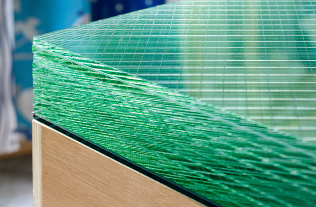
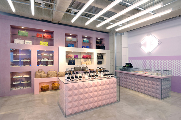
The uniquely designed shelves are distinguishable by a three step, high-mid-low, price display system to represent the differing tiers of Kimono. These industrial layer glass tables facilitate the easy unfolding of each Kimono as a way of presenting each characteristic fabric to the customers. The solid glass material used in the design represents the merging of different environmental themes, in which shading and reflection help to soften and graduate the contrast between soft and hard. The course materials of the display unit are designed to contrast with the softness and sophistication of the clothing fabric, and the layered shadings accentuate the varied colour schemes of the Kimono. Culturally, the way to present Gofuku is by coordinate the various layers of material, in a similar way to modern western fashion coordinate. Seki introduces this method as part of a design concept by using the motif of layering as a way of representing these fabric variations.The bold shelving at the forefront is designed to display mid-price Kimonos and also serves a function as an upright stand, and possess a dynamic facade created to hold the dividers without the need for wall stands. It was inspired by a Japanese historical element of facade called “Noren”, a semi-indivisible fabric with a divided curtain. This primary shelf conveys the theme of inside and outside merging together as one.His design approach demonstrates a flexible and sympathetic understanding of cultural spaces, in the context of their location and history, whilst also striving to make the most of a smaller, limited space, by creating a store in which customers will feel welcomed.


Photos: Takumi Ota.


