ZURICH.
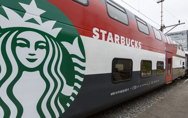
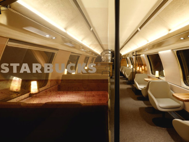
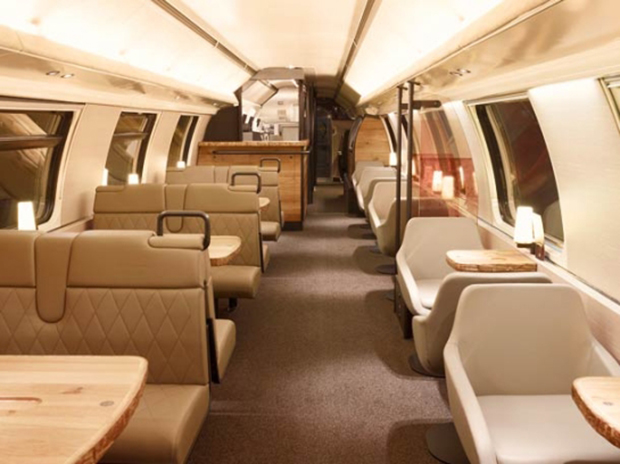
Starbucks is always looking for unique ways and places to connect with customers and together with SBB they created an inviting area where travellers can relax and enjoy their journey. The design is contemporary and focused on comfort, yet at the same time functional. This combination is expressed through beautiful design elements and a color scheme inspired by coffee.
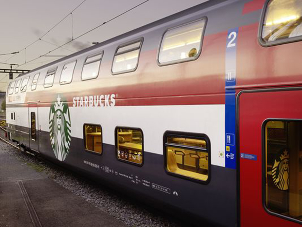
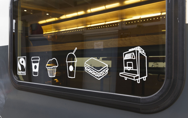
The exterior of the sleek red and white car is branded with Starbucks siren logo on both sides including ‘Starbucks’ text. White icons representing menu items including beverages and muffins, as well as the Fairtrade symbol and an image of Starbucks espresso machines were created and placed on the windows to highlight the offering inside the train car.
Inside, the experience on the car is split between two levels and features a warm and welcoming color palette inspired by the shades and tints associated with coffee, from dark roasted brown beans to snowy white steamed milk.The two levels provide seating for a total of 50 people.


Photos: Starbucks.


