
 LOS ANGELES.
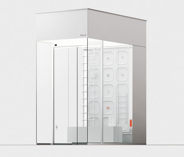
What if a convenience store were inconvenient?
The offerings of a convenience store are as colorful as the cereal isle in a grocery store, but the inconvenience store is grey and white, with the slightest bit of pink.
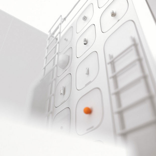
A fictional store, the inconvenience store is built on a traffic island at one of the busiest intersections in Samsung-dong. Given the space and its surrounding, the shape of the building is naturally small, lean and tall. The inconvenience store carries only one of each product, adding up to an inventory of eleven: engagement rings, pet rocks, ice cream cones, latex paint, carbonated water, whiskey, red wine, toothpaste, condoms, grapefruit and ladders. Conceptualized by Michelle and designed by Andrew, the store is one of the central locations mentioned repeatedly in a short story within felt. In the story, the male protagonist often visits the inconvenience store in hopes of buying an orange, but he always ends of up finding the same things. One fruit, one wine and one whiskey to make up the inventory.
Incovenience Store is a project and product designed by designer duo, Ichelle Im.


Photos: Ichelle Im.


