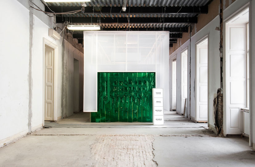
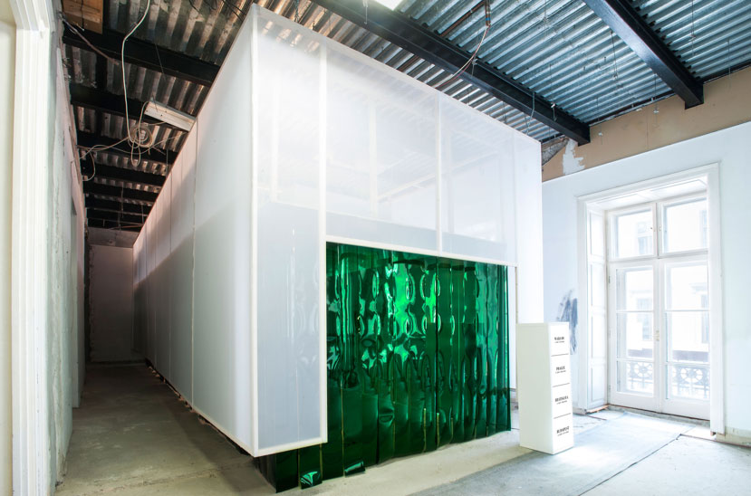
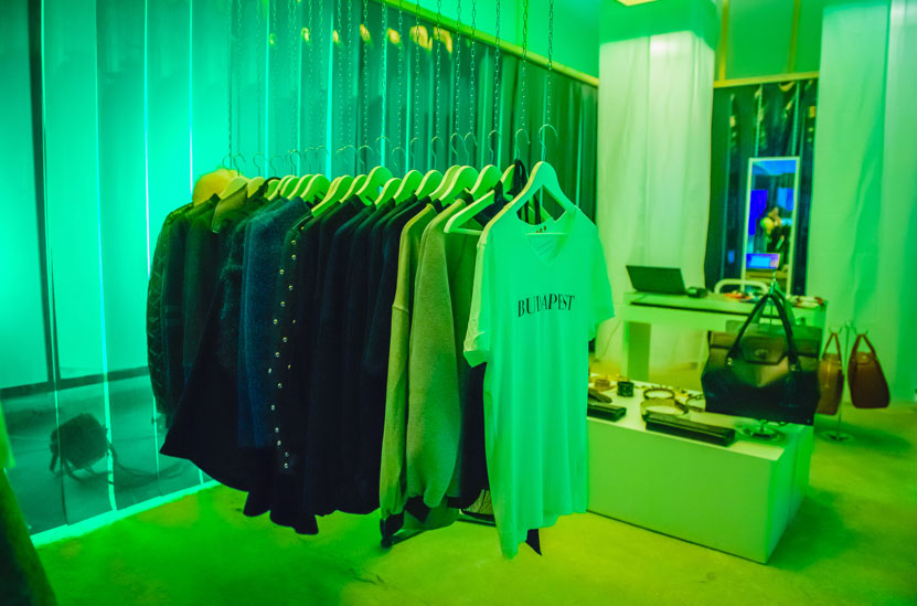
This 38 square meter installation is placed in a building that is currently under reconstruction, its’ concept is to construct an installation within a reconstruction. The whole installation is hanging from the ceiling. It’s quite heavy and monstrous, yet it looks very light as it’s hovering above the floor.
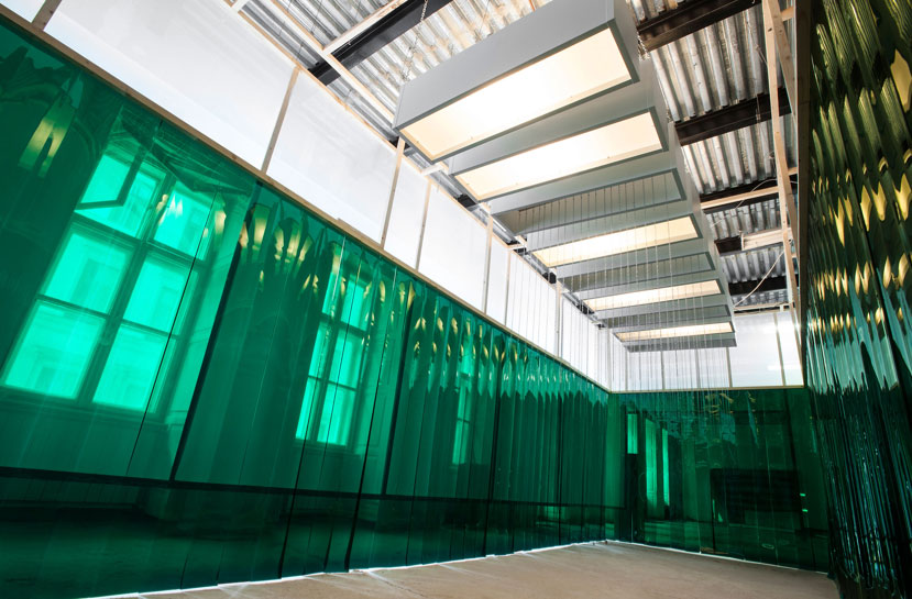
Heineken pop-up store is a project designed by Miklos Kiss at Budapest Design Week 2014. He has used quite unusual materials for that space, there is this green net material that is usually used for insulation. The other one is a transparent textile, that has a net pattern too. White and green colours are representing the strong branding of Heineken. 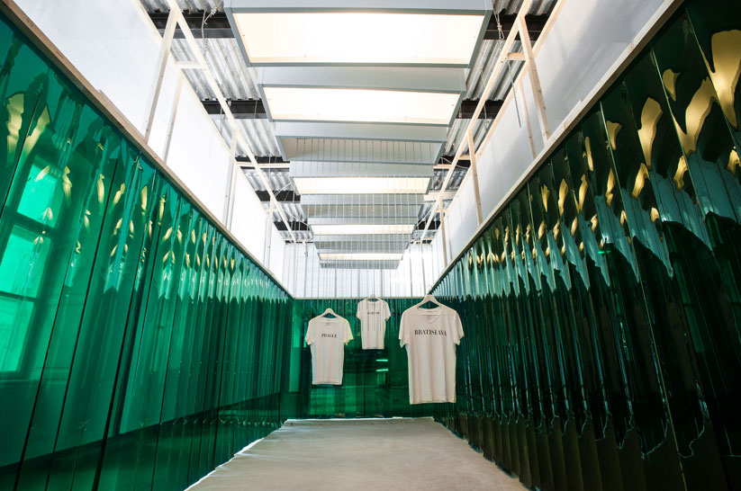 The store’s set up resembles of the very basic structures of antic and christian churches: there is an inner and an outer frame. Walking towards the cashiers is a metaphor for walking to the sanctuary. In a way this installation became the church of the fashion week.The purpose of this place is not only to shop, but to spend time here, and that time should be a relaxing experience.
Photos: Bera Sándor & Bálint Jaksa.


