TOKYO.
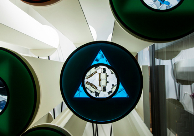
Hermèscope is the title of a window display I designed for Maison Hermès in Japan to inaugurate their new spring/summer collection 2014. Hermès’ annual theme for the windows is “Metamorphosis”, and so with that in mind the idea was to create a ever changing display.
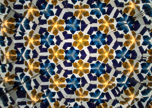
The starting point for the project is the mythic “Carré Hermès” created in 1937 which pattern is screen-printed on silk. Applying the principle of the Kaleidoscope to the different windows of the Maison Hermès in Ginza allows the passers by, to contemplate an ever-changing set of patterns that evolve slowly and are created using the Hermes S/S 2014 collection.
Beyond the idea of the Kaleidoscope is the relationship between science and nature, and my fascination for mathematically modeled shapes. Symmetry in one or several axes is common in nature. Flowers, starfish and many other animals show symmetrical patterns on their body. This symmetrical characteristic, which is abundant in plants and flowers to create patterns, is used here to suggest the spring but also the constantly changing cycles of nature.
The installation aims to generate a visual metamorphosis of shapes and colours, producing intricate patterns that change in real time, and are made by framing details of the items that form the Hermès S/S 2014 collection.
Hermèscope is a project of Oscar Diaz.


Photos: Satoshi Asakawa.


