
MILAN.
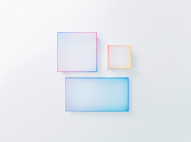
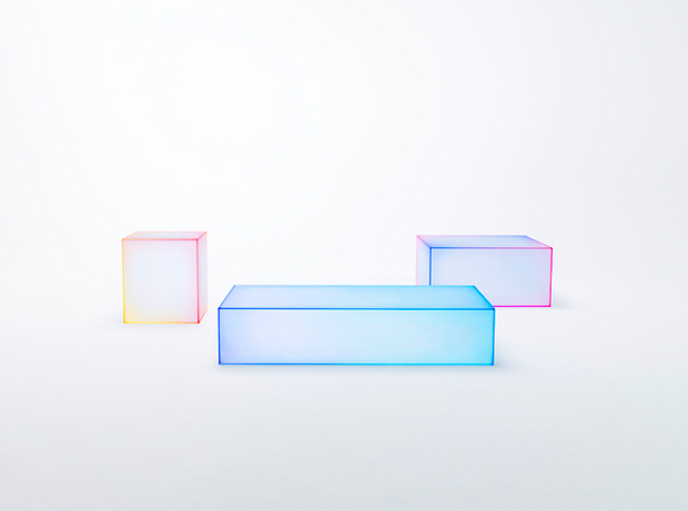
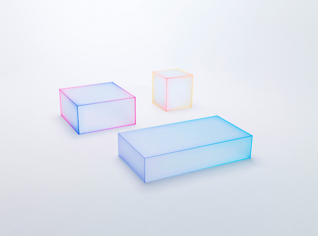
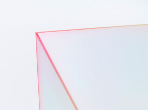
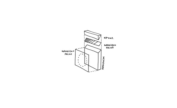
Three types of low tables that are of the shape of a box using 5 sheets of frost glass.
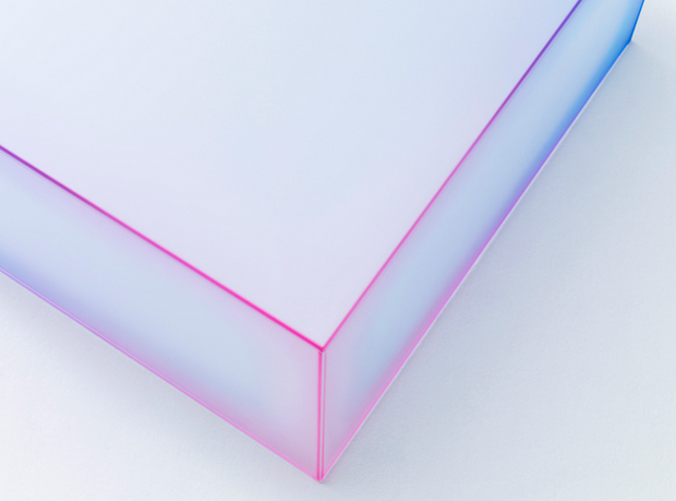
For the joint between two sheets of glass, the cross-sections with an angle of 45° were printed with bright colours. These cross-sections were then bonded together. These colours had a gradation effect, such as from purple to red, orange to yellow, and blue to purple. What is more, the reverse side of the frost glass was printed with a pattern to make it look as though the same colours were blurred on the glass surface.
With this, Nendo tried to create a natural and soft image, as if the colours on the edges were blurring. By combining the extremely difficult technique of printing gradation colours on the diagonal edges with the printing that expresses a delicate “blurriness”, an appearance that contradicts the conventional image of glass, which is of a hard and sharp material, was achieved.
Photos: Kenichi Sonehara.


