 LOS ANGELES.
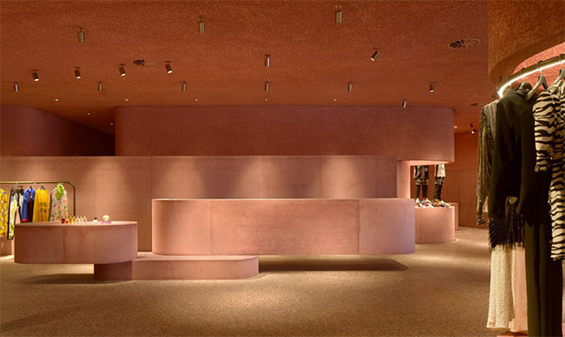
The Webster’s latest flagship store in Los Angeles is a new 11,000 square feet ground-up retail development adjacent to the historic Los Angeles Beverly Center designed by London-based studio Adjaye Associates. Juxtaposed beneath the monolithic eight-story structure, The Webster elegantly asserts itself as a sculptural and experiential counterpoint to the Beverly Center’s retail experience. The cantilevered concrete facade references and reimagines the brutalist shell of the original existing building and is injected with a pink dye—an ode to the luminosity of California, where the Pacific light naturally amplifies saturated colors.
At the main entry, a panoramic window—comprised of three sheets of curved glass—creates an angular visual portal, dissolving the boundary between the public space and the retail inside. Conceived as a landscape of forms for display and inhabitation, the color and material palette of The Webster’s exterior identity continue into the interior. 

 Photos: Laurian Ghinitoiu.


