 MILAN.
Andrea Marcante and Adelaide Testa have designed a renovation and extension for Imarika store, one of the most well known womenswear multibrand stores in Milan’s Porta Venezia neighbourhood.
The project studies the space carefully, enhancing it with architectural elements that have a clear and precise formal and functional identity.
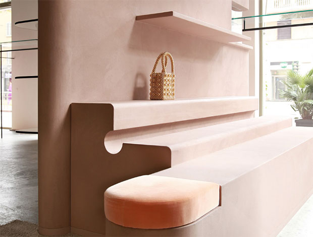
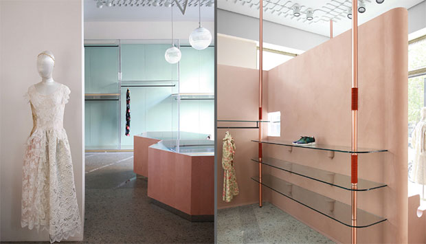
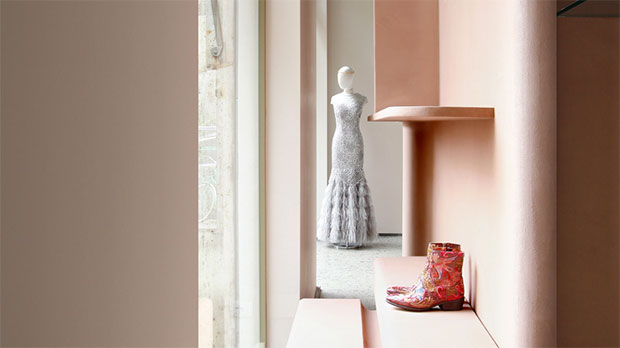
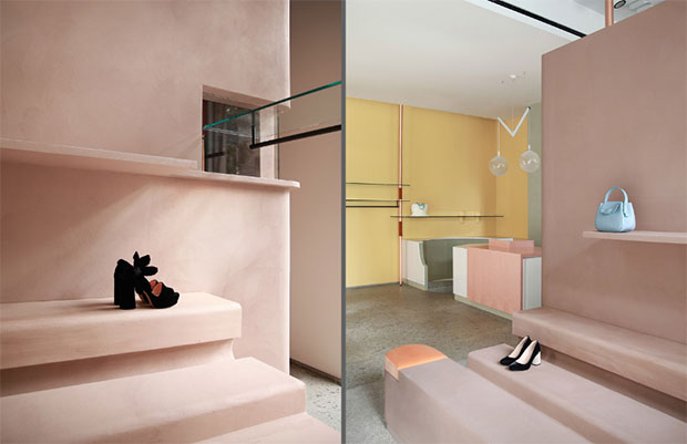
The shop is divided by an angular wooden screen that has been plastered in clay, which articulates the different display areas and also becomes a display in itself (both for the windows and for the shop’s interior), on which shoes, bags and accessories can be placed. Another small architectural element, also rendered in clay, contains the changing rooms.
The horizontality of the display cases is offset by a system of struts made of copper tubing inset with woven braid trim, which support the hanging rails and direct the gaze towards the decorative ceiling. The overhead lighting then becomes an intrinsic part of the plasterwork decoration, which turns the ceiling into a sort of upside-down carpet.
The large acrylic plexiglass system of cupboards and the made-to-measure lighting fixtures give the suggestion of the domestic dimension that represents the medium between the product and its audience.
The formal expression and the consideration of material – from the clay to the pink briar wood used for the hexagonal display cases and the sales counter, as well as the white gloss laminate, the plexiglass. the copper and trimmings – do not interfere with the architectural shell, but instead create an architectural landscape; an approach that makes reference to the extraordinary experience of the Olivetti shops, designed by Franco Albini, BBPR and others between the 30’s and the 50’s. 

 Photos: Marcante-Testa.


