TOKYO.
A new pharmacy has opened its doors in Omori, Tokyo.
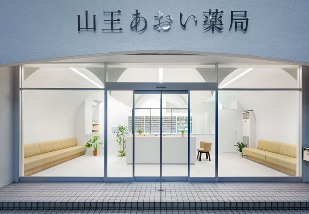
This dispensing pharmacy is facing a street on which some competing pharmacies are located. So it was also requested to create a distinguished facade rather than its interior design.
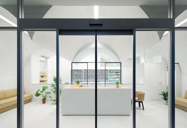
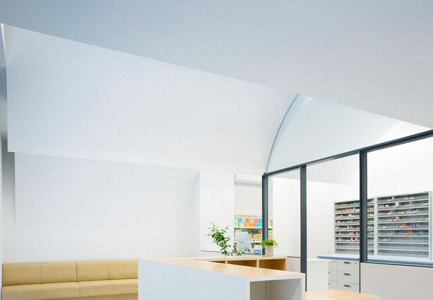
Mainly two elements, glass partition and three-vaulted ceiling, form the space. The glass partition in the middle of the pharmacy separates it into two parts, front and back, customers zone and dispensing zone. And the three-vaulted shape gently indicates reception and waiting space for patients. Covered with the vaulted ceiling, patients can feel cosy and relaxed atmosphere. The three-vaulted shape can be recognized from outside and the design differentiate the pharmacy from others on the street.
The design of this unique pharmacy in Omori is a project of japanese studio, Mamm Design.


Photos: Takumi Ota.


